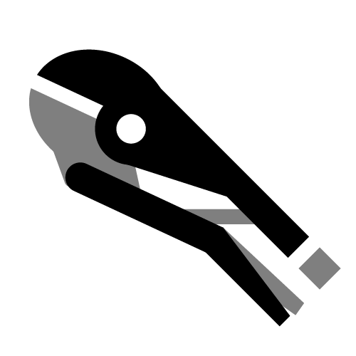
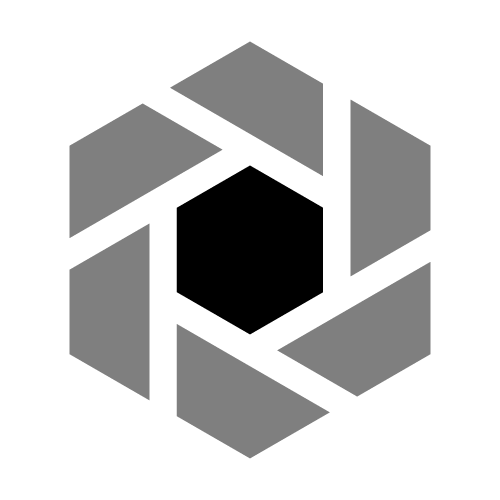
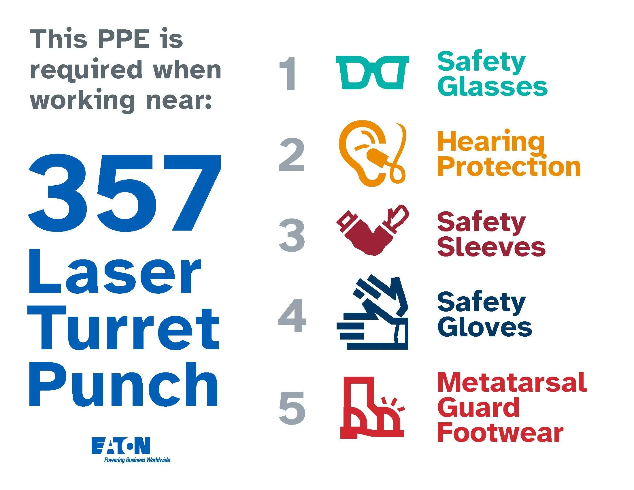
My department at ToolingU-SME needed a unified, utlilitaruan icon set that covered both business and HR concepts, as well as manufacturing and safety.
My solution was to (mostly) borrow the grid and style from Google’s Material icon set. This saved time on branding and allowed team members to use Google’s thousands of options while staying on-brand. About half a dozen of these ARE Google’s icons, just tweaked for our needs.
Generally I export these as single color SVGs with an alpha channel, which lets them be re-tinted in MS-office programs like a smart-art shape (this doesn’t work in Storyline, so I mostly use white icons over color/photos).
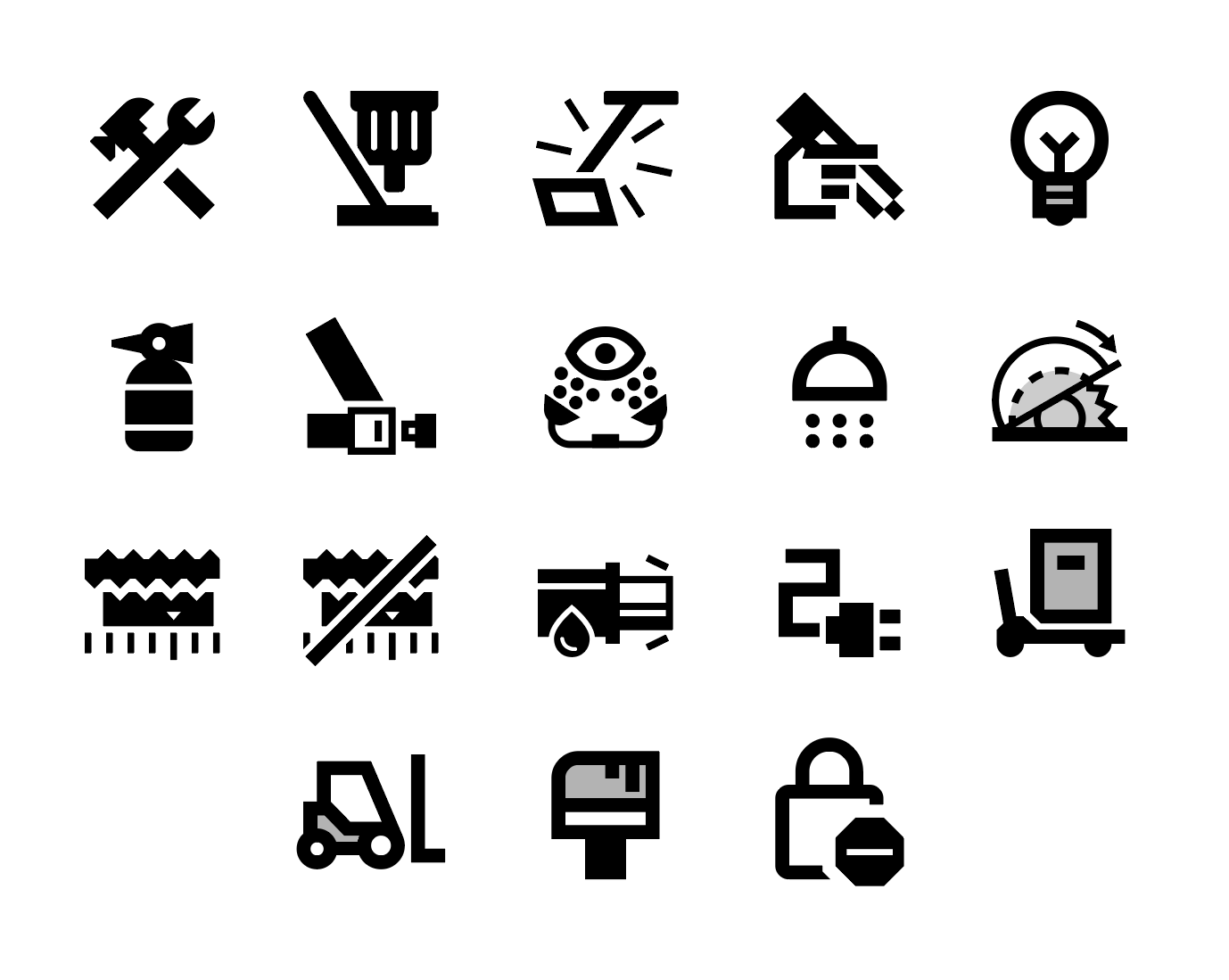
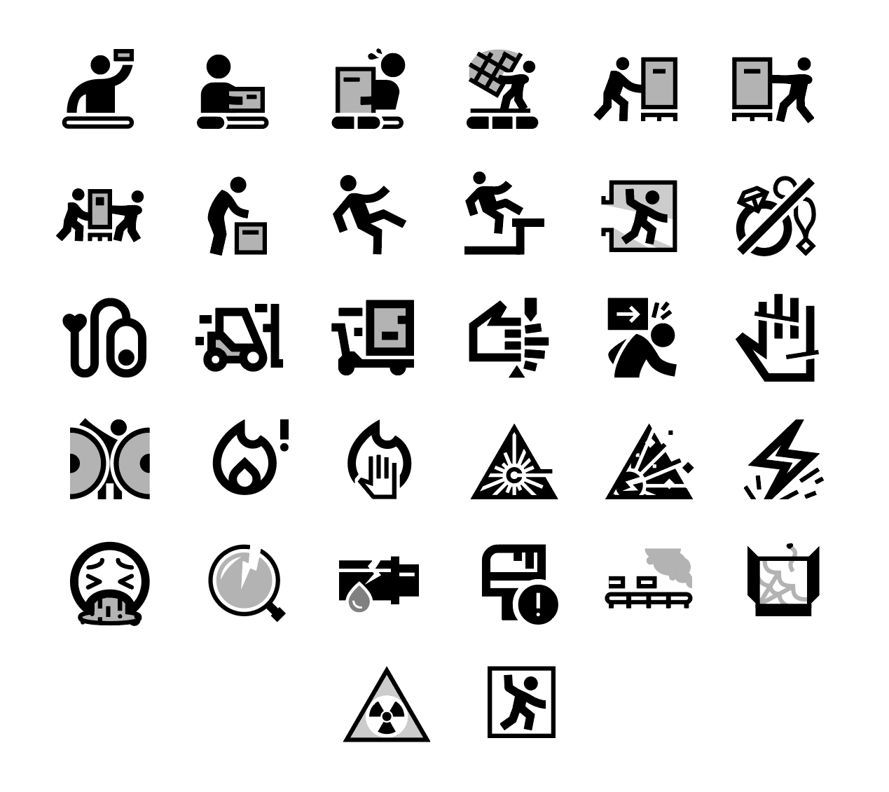
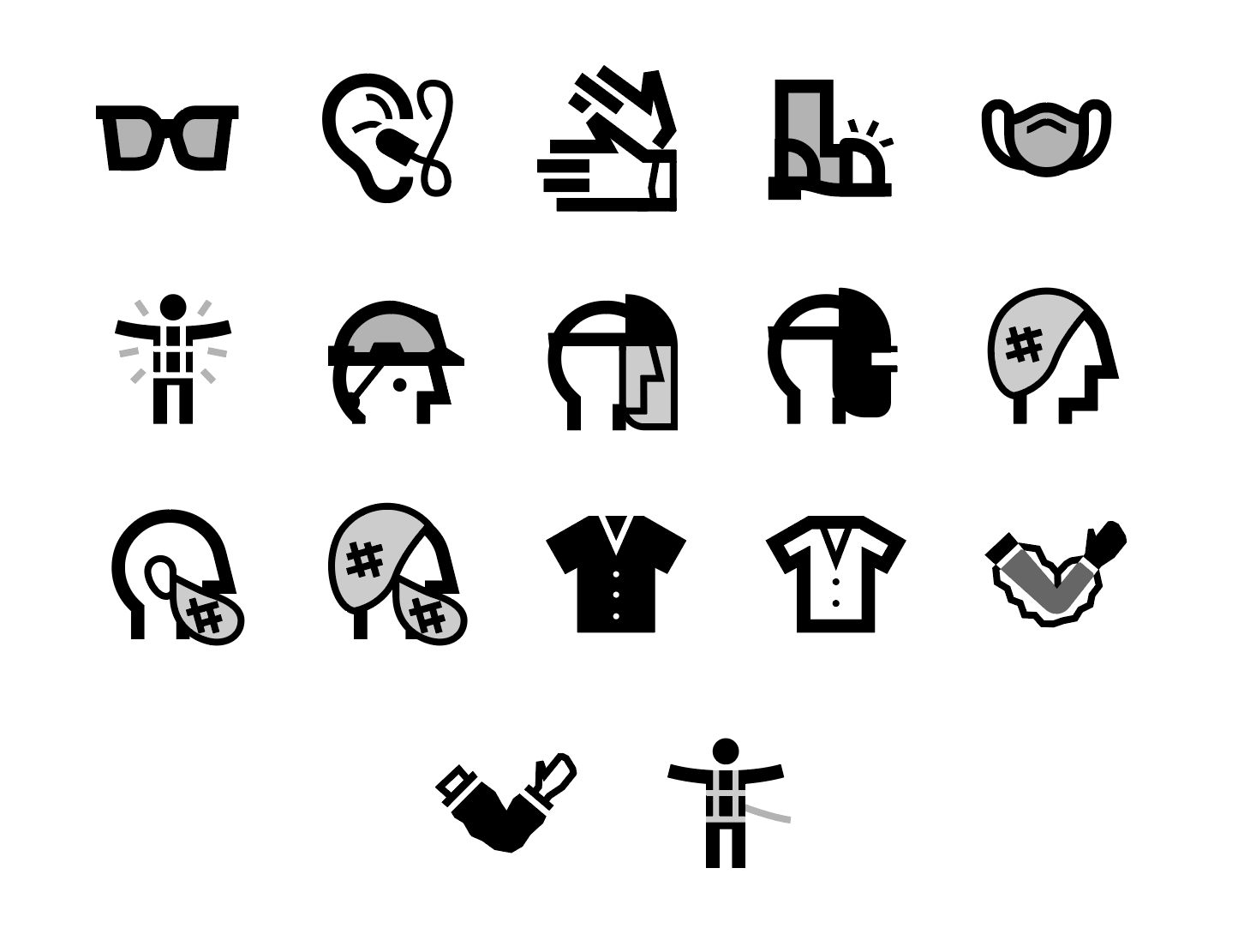
This client needed a sets both for their Business Continuity Plan, and their work instructions: